Documenting a Before-and-After with Chrome: Screenshots That Enable Fair Comparisons

How to compare two versions of a page using the same framing and explain the change without claiming results an image cannot prove.

A before-and-after comparison should make the design decision visible. If the first image shows a desktop screen and the second a phone, readers may struggle to distinguish the redesign from the change in format.

The most useful comparison keeps the same framing and explains the problem it addresses. It does not need to portray the old site as a disaster or credit the design with sales growth that screenshots cannot establish.

Table of Contents

Decide what you want to show

Before opening a capture tool, identify the question: is the offer easier to understand? Does essential information appear earlier? Can the button be read on a small screen? Give each comparison a focus. A full-page view shows the overall rhythm; an enlarged detail works better for explaining a specific decision.

For example, if a services page has been reorganized, compare the same part of both versions. Point out the change in hierarchy and explain its purpose: helping visitors distinguish the services and find their next step. An image shows the presentation; it does not prove that inquiries increased.

Match the capture conditions

Use the same page, language, viewport size, and scroll position. If text or images changed as part of the redesign, explain that: they are part of the comparison. If one version has a cookie notice or open menu and the other does not, match those states where possible.

In Chrome DevTools, Device Mode lets you enter the screen width and height. For example, two screenshots at 390 × 844 CSS pixels allow a mobile comparison with the same available space. Use the same scale and capture method as well. Repeat on desktop if you want to show how the composition changes across formats.

A small detail can explain a big decision

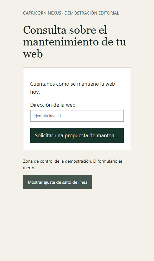
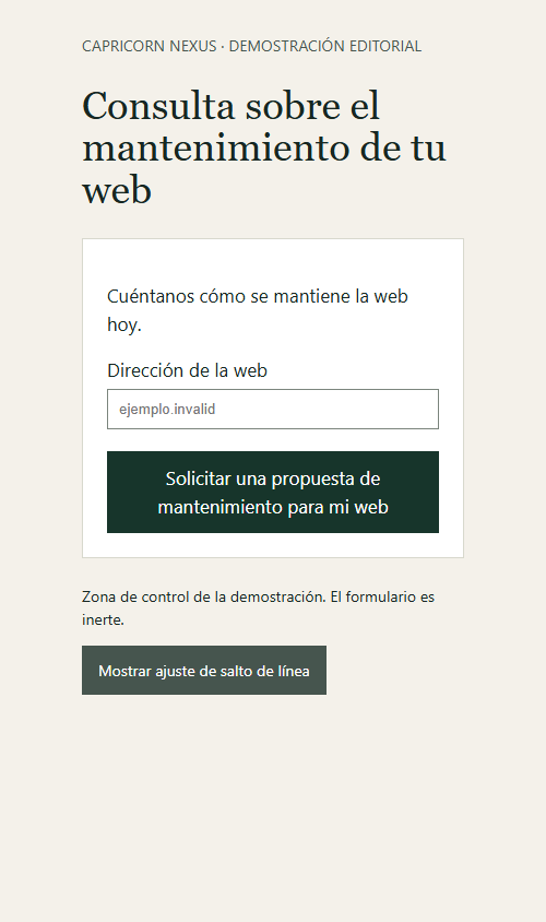
In this illustrative example, a form button keeps the same width and message. The first version truncates the label; the second allows it to wrap onto two lines. The change makes the full text visible without asking the visitor to guess the action.

Example of a form button with a truncated label.
Before: the button label is truncated.
The same button displays the full label on two lines.
After: the same button shows the complete label.

The screenshots show a difference in presentation. Separate checks are needed to confirm that the form submits an inquiry, that the message reaches the right person, and that the form works with a keyboard.

Keep context with the images

Keep unmarked originals and prepare annotated copies for presentation. Record the page, date, screen size, and what each state represents. If you compare a detail, use the same crop in both images. This simple context helps someone understand the decision without relying on an oral explanation.

For client work, agree on which materials can be shown and distinguish the studio’s work from content or photographs supplied by others. A well-documented comparison can support a project case study, an internal review, or a discussion of improvements; it does not need exaggerated results to be compelling.

If you are considering changes to an existing site, the scope of the redesign should state what will be retained, what will change, and how it will be reviewed before launch.

Leave a Comment

Your email address will not be published. Required fields are marked *

Scroll to Top